

There are thousands of infographics, images and guides explaining how to use color psychology. Usually, these infographics look something like this:
- Red = anger
- Blue = trust
- Green = health
A never-ending list explaining exactly what color creates what emotion.
Countless businesses use these guides to determine the color of their brand, the background and hero image on their landing pages or the color of their call to action buttons.
The problem?
Color psychology doesn’t really work that way.
Sorry to be the one to tell you this, but thinking that every single colour creates one specific emotion for every person in the world is simply incorrect.
Most businesses aren’t aware of this, they follow these guides blindly and unfortunately using the wrong color can actually set you back or even hurt your conversions.
Here’s one thing I do know from running thousands of AB tests:
If you use color psychology the right way, you can influence your target audience’s decision process. Used correctly, You can help people feel the way you want them to feel and increase conversions.
So how do you use color psychology the right way?
Well, that’s what I’ve covered in this color psychology guide.
Here’s what we’re going to learn:
- What color psychology really means (fo realz) and how it works
- The emotional effect colors have on us (and your customers)
- Myth busting: The biggest color psychology myth and how to avoid it
- How color affects people (as in, your customers) on 3 different levels
- Age, gender and other elements that affect color psychology
- Mobile vs. desktop color psychology (yes, there’s a difference)
- How to know what colors to use on your audience
- How the most successful companies in the world use color psychology
- A case study – How we use color psychology to grow conversions
Pssst… download our color psychology worksheet here.
Table of Contents
What color psychology really means and how it works
“Color psychology is the study of hues as a determinant of human behavior. Color influences perceptions that are not obvious, such as the taste of food… Color can indeed influence a person; however, it is important to remember that these effects differ between people. ” Wikipedia
Bottom line?
Color has the power to affect our behavior and influence our decision-making process (as in – “should I buy this or not?” kind of decisions).
[easy-tweet tweet=”Color affects our behavior and influences our decisions (as in – “should I buy this or not?” kind of decisions)” user=”taliagw” template=”light”]
How colors affect our brain
Color impacts our brain which in turn impacts our feelings and senses. The effects can be both physiological and emotional. Research shows that color and light can affect our mood, heart rate, sleep and even our well-being.
An interesting example can be seen in our everyday lives; blue and green light (e.g the sky and nature) stimulate us and wake us up in the morning which is why many doctors and scientists recommend not using our mobile devices before we go to sleep as the screen’s light wakes us up and can cause insomnia.
In 2015 a study found that the color blue reduces stress, slows down heart rate and lowers our blood pressure. Many countries use these techniques to their advantage, for example, the government of Tokyo has been known to use the color blue in their train stations to reduce suicide rates, resulting in 74% fewer suicides. However, this research is still inconclusive and gets challenged all the time by different scientists.
While the question of what color creates which effect continues to be a debate, one thing is clear to all scientists: Color does indeed affect our physiology, our brains and our emotions.
How colors affect our emotions
There’s a reason some of us get a warm, happier feeling during springtime when all the blues, greens and bright colors start appearing in flowers or that we feel more gloom in the winter when things get grey and dark. Whether we think about it or not, colors have an emotional effect on us.
If you consider the amount of time and energy we spend on choosing the right color of the clothes we buy or the paint we use in our house you’ll see that while most of us don’t really understand how it works, we do know that colors matter and affect us in some way or another.
And of course, businesses have long known that colors affect our emotions and have been using them for decades in their advertising.
The important thing to know about emotions, is that they affect our decisions. The way we feel about ourselves, our surroundings and the events that happen in our life determine what actions we take, what we buy, what we throw away and much more.
Emotions are so incredibly important in decision-making that a study by Antonio Damasio years ago proved that without emotions, we aren’t able to make even the simplest of decisions (even choosing what sandwich we want for lunch becomes impossible).
When you combine the fact that colors affect our emotions and emotions affect our purchasing decisions, there’s no wonder why companies buy in quickly to those beautiful infographics that claim “red will get people excited about your product” or “blue will convince people you’re trustworthy”.
However, as I mentioned, these infographics are quite wrong.
The biggest color psychology myth
Interestingly enough, when I talk to my clients about emotional targeting one of the first objections they bring up is that not all people feel the same, so how could we use only a few specific emotions to target everyone?
Their biggest concern is that people are different and don’t respond to the same emotions as everyone else, however they never stop to consider the same with color psychology.
People rush to determine that each color has one specific emotion connected to it and use those colors in all their funnels. However, a lot of research shows that color psychology just doesn’t work like that.
“Like other theories… colour theories have too often been strongly normative and weakly analytic. They have been used (abused?) to create guidelines and prescriptions for action, but they are too weak in predicting what the settings will be like when completed and how its colours will influence the users.” Tofle et el
Colors affect us in many different ways, and just like we don’t think every single person who visits our website from Berlin using their mobile phone needs to see the exact same message as other mobile visitors from Berlin, not all people respond the same way to colors.
One of the biggest misconceptions is the “blue for boys and pink for girls” rule, an approach many retail companies use. Many studies have shown that babies and toddlers are actually attracted to the same colors (red and blue), in fact, pink isn’t mentioned in any study as a major influence on girls. Studies show that there are rarely any gender differences in preferred color yet businesses continue to divide people according to their gender because a few infographics and guides claim that boys are more influenced by blue and girls by the color pink.
So how did we get it in our mind that girls like pink and boys love blue? well, research shows that about a century ago all babies were dressed in white dresses, the idea of blue for boys and pink for girls was created by retailers who wanted to get parents to buy new clothes for their kids and not depend on what they had previously bought for their first child.
Hundreds of companies have branded themselves pink or blue because they were told that was the preference of their main target audience, when in fact that isn’t true at all.
Many authors of blog posts and guides tend to make sweeping statements about color psychology that are supported by what they’ve read online or their own personal experiences. However these cannot be regarded as rules or guidelines for all.
“While the studies argue for the existence of colour-mood association, there is no reliable evidence to suggest a direct relationship between a given colour and a given emotion.” EBDJournal
Another example is the color red. Red is probably the most researched color in the world and is regarded as a color that creates excitement and desire. Or is it warning and danger? Depends on the blog post you read. 🤷🏽
Different studies show that red triggers different emotions, and that’s the bottom line of all this:
Different people will feel different things when seeing the color red (or any color for that matter) because we’re different people. We feel differently about each color because of the different experiences we have in life, our culture and the symbols we attach to each one.
If you want to use color psychology the right way (and increase conversions in the process), you need to understand that colors affect us on 3 different levels:
The 3 ways colors affect our emotions
To use color psychology effectively we need to first understand how our target audience assigns certain emotions to specific colors. If we understand how these emotions are established towards specific colors we can then choose the right colors we need according to the emotions we want to enhance.
#1 Culture
Unsurprisingly color means one thing in one culture and another in a different culture. As a quick example, in the Western world white is more commonly seen as a pure color worn at weddings and festive events, while in China it’s perceived as a mourning color.
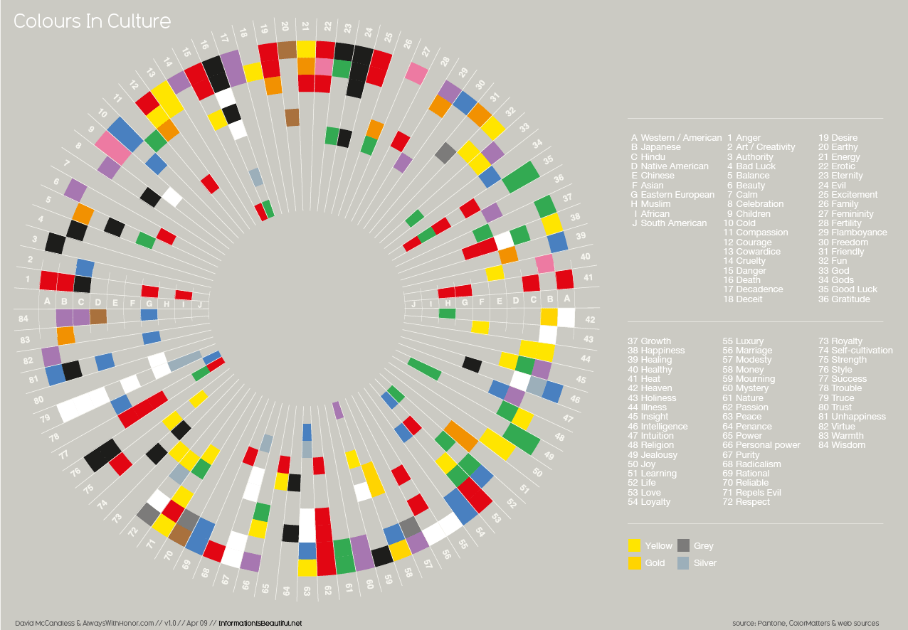
Source: informationisbeautiful
Before choosing a color for your audience, be sure to understand their culture and what the different colors represent for each. A few other examples:
- In the Western and Japanese culture, red symbolizes anger while in Hindu anger is represented by black
- In Japanese and Hindu culture purple represents wisdom, while for Native Americans you would use brown and for Eastern Europe you’d use the color blue.
- Love takes on different colors in different cultures too: red for Western and Japanese, green for Hindu, Yellow for Native American and blue for African
The same exact colors with completely different emotions and meanings all over the world.
#2 Symbolism
“Our preference for a specific color can be related to how we feel in any situation, how we want to feel, and even how we remember certain experiences” Joe Hallock
Along with culture, we also assign different symbols to different colors. For example, for some, yellow will always signify the sun, for some it may symbolize a stop light. Green might mean “Go!” for some and nature for others. These symbols we attach to each color are affected by both our culture and our experiences.
#3 Emotional Experiences
The different experiences we go through in life also affect how we perceive color. For example, for some the color blue, reminds them of the ocean, freedom, the beach or perhaps even a holiday, and for some, it may remind them of a sad experience, loneliness and detachment.
In order for us to choose the right colors for our audience we need to understand them better, not just their geographical location or device they’re using, but them – where they come from, what they believe in, what they care about and what matters to them most.
Now that we understand the 3 different levels that color and emotion can be impacted by, we can dig deeper into understanding who our customers are, what culture they come from, what experiences they’ve gone through in life, what scares them and identify the colors that will impact our audience in the best way.
How to choose the right colors for your audience
In order to really choose the colors that influence your visitors and help them convert, you’ll need to first identify what emotions influence your customer most.
You’ll need to first go through the process of identifying their emotional-drivers, the outcomes their searching for and the real reason behind their conversion.
Assuming you know what emotions you need to emphasize, you’ll then need to do the following to choose the colors that will create those emotions for your customers/visitors:
#1 Behavioral data
The first thing you’ll want to do is go into Google Analytics or any other reporting tool you’re using and analyze your visitors’ behavior. The following metrics are a good place to start from:
- Identify their geographical location so you can determine the different cultures
- Language is also a great way to see the differences in culture in specific countries.
- Age and gender – we’ll dive more into why this further down
- Search terms – look into the words and terms people are using to get to your site or searching for on your site, this also gives a great indication to peoples’ hesitations, concerns and needs.
These metrics will help with choosing the right colors for your specific audience. For example, if you want to highlight emotions such as fun, excitement and energy you may gravitate automatically towards orange and red, however, if your target audience is from Ireland or South Africa that could be a mistake.
#2 Age
Research shows that color preference changes as people get older. The basic “popular” colors such as red and blue stay high on most people’s lists but preferences to other colors such as yellow, green and others tend to change a lot.
“With maturity comes a greater liking for hues of shorter wavelength (blue, green, purple) than for hues of longer wavelength (red, orange, and yellow)” Color Psychology and Color Therapy, 176
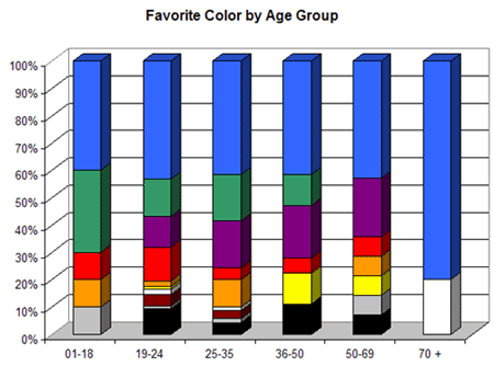
Source: Joehallock.com
If your audience belongs to a very specific age group, you may want to consider the chart above. Specifically with a more elderly audience, the colors will also impact their ability to read your content and feel safe.
#3 Gender
In his research, Joe Hallock found that there are some significant differences in color preferences when it comes to gender.
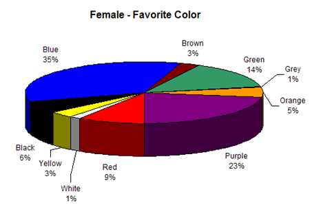

Another study showed that men prefer bright colors and shades, while women prefer soft colors and tints.

While these studies show that men prefer the color blue significantly over women and that women place orange as the least favorite color, unless you have just one gender as a target market, I wouldn’t rush to change my color pallets without doing a more profound research, including all the metrics I mentioned above.
#4 Contrast
One of the most important things to consider when choosing a color is its contrast. It’s not just the color of a button or of the image we’re talking about, it’s every color on the page, including the background. Other than being persuasive and highlighting certain emotions, color must also be used to provide clarity and help people read your content. Make sure the colors you choose work with the entire page, support other elements and most importantly, the text.
#5 Device
On mobile we behave differently than on desktop and we have a very different mindset. Mobile optimization in itself has its whole other category but know that we also feel differently about colors according to the size of screen we’re holding, where we are (e.g – office vs. bus) the time of day and even what type of day we’ve had.
While there aren’t many studies on the topic, it’s worth thinking about it when you choose your colors and considering making slight changes to the colors you’re using in your mobile designs to suit your visitors’ needs.
If you’d like to learn more about mobile, check out our thorough guide here.
How the most successful companies in the world use color psychology
There are some pretty amazing case studies of companies who’ve used color psychology to grow their business.
Heinz green ketchup comes up as one of the first examples.
It’s the same ketchup, only green. Yet, despite having made nearly every possible list of “world’s weirdest foods,” it resulted in the highest sales increase in the history of Heinz.
10 million bottles sold in 7 months. Heinz factories had to work 24 hours a day, 7 days a week to keep up with demand.
They used the emotional power of color to create $23 million in additional revenue for the company taking a condiment everyone believes is dreadfully unhealthy, and turning it into a health product by painting a red label green.
Is this the only reason Heinz made so much money?
Because green equals health?
Nope.
There were many other elements in play here, one of them being the ‘Bandwagon Effect’ – a psychological trigger that affects our tendency to change our opinions and decisions according to the number of people who think or act in the same way. Essentially, the more people purchase something and talk about it in a certain way, the more likely is it to grow in popularity and be trusted.
That’s the thing about color psychology, it doesn’t work alone. Every element on your page: the copy, the images you use, the colors, the bullet points and even the font, all work together to help people feel a certain way. It would be wrong to think that simply changing the color of your background or the color of a button could produce real, scalable increases in conversions.
[easy-tweet tweet=”Don’t think that simply changing the color of your background or button will produce scalable increases in conversions, that’s not how color psychology works.” user=”taliagw” template=”light”]
These changes in color are done with a lot of research. Just a few years back, McDonald’s changed all of its European stores from red to deep green to change the public’s opinion on them. This change didn’t come alone, sure it was the most noticeable one, but along with the green redesign came new healthier meals and a series of ads highlighting the nutritional benefits of eating a McDonald’s burger for lunch over a salad. It was an entire strategy aimed to reduce their bad rep and brand them as a more healthy option.
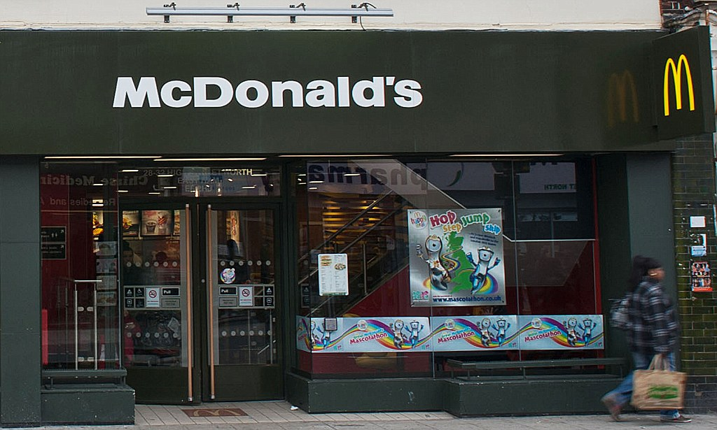
Source: DailyMail
A color psychology case study
If you’ve watched any of my webinars you probably know that I am a strong advocate for using color psychology to increase conversions.
As part of our process at GetUplift, once we complete our emotional targeting and data research we identify the emotional triggers we want to test on our client’s pages and choose the colors, images and copy that support that hypothesis.
One of our past clients was faced with an ongoing roadblock; their product was almost 3X the cost than their competitors. The difference in price was due to many different factors (e.g the quality of the platform and its abilities) and required a strategy that would emphasize these differences to their audience, a strategy that will help people understand why it’s worth using our client’s product over others despite the cost.
Their landing pages were getting significant traffic but they weren’t doing too well.

After completing our conversion optimization analysis and emotional targeting research, we created a new variation according to our hypothesis.
Our hypothesis was that in order to increase conversions we need to to show parents (the main target audience), that this product will:
- Help them throw the best party for their kids
- Set them apart from other parents (stand out)
- Set them up for the party of their dreams without working to hard
As you’ll see below, many changes were implemented. A new hero image, new copy and content, a much longer page, additional information that wasn’t included in the original landing page, and new colors, primarily purple and green.
Purple has long been associated as a color of royalty, prestige and power (it actually stems all the way back to Queen Elizabeth 1). The changes we made to this page resulted in a 42% increase in revenue for our client.

It wasn’t the colors alone that produced these results, but without them it wouldn’t have worked as well as it did. The purple and green colors supported the entire strategy we were testing and that’s how color psychology should be used, as a tool that can support and amplify tour strategy.
Your Next Steps
Here’s what you should be walking away with from this guide:
- If you’re going to use color psychology (which you should), forget about the infographics and best practices people share and start doing your own research on your own audience. What worked for your competitor, will not necessarily work for you.
- Color psychology is just part of your entire optimization strategy. If you want to truly optimize your funnels for higher conversions you need to take a step further into understanding your customer’s experiences, state of mind, culture and most importantly, their emotional-drivers. Only then can you truly utilize the power of color psychology to grow your conversions.
Let me know in the comments if you’ve used color psychology before, and how you choose the colors for your pages.
Talk soon,
Talia
Facebook Comments
Powered by Facebook Comments
Excellent, just excellent. In the paragraph:
How to choose the right colors for your audience
You link to: https://getuplift.co/landing-page-optimization-complete-guide/
When talking about emotional drivers, don’t understand fully (no news there! :-)), would this post make more sense:
https://getuplift.co/emotional-targeting-leverage-the-power-of-emotion-to-grow-conversions/
Please note that I’m a tired two child dad, and suffering from a weak intellect going in to parenthood.
Keep up the good work! I really enjoy blog!
Thanks!
Really insightful post, thank you so much for doing a deep dive. Colour is fascinating, and your post has expanded my knowledge since writing about it 2 years ago.
interesting ! Thanks for information !